California's Clean Energy Transformation
A Data-Driven Analysis of Grid Evolution from 2020 to 2025
Key Findings at a Glance
- Clean Energy: California's grid reached 62% clean energy by 2025 (when imports are properly classified)
- Natural Gas: Gas generation fell from 8,406 MW to 6,188 MW average daily (-26% decline), with gas share dropping from 32% to 24% of total supply
- Battery Storage: Grew from near-zero to 11 GW capacity, reaching up to 65% of peak demand on some days
- Renewable Penetration: Hours exceeding 100% renewable generation increased dramatically, with some days achieving 10-11 hours of 100%+ clean energy
- Negative Prices: Battery storage curtailed negative pricing events by 2025, after they peaked in 2024
- Price Impacts: Battery deployment drove significant price cannibalization, with ancillary services and energy arbitrage revenues declining
Table of Contents
1. Introduction 2. Capacity Factors: Understanding Generator Utilization 3. Ramp Rates: Grid Flexibility Requirements 4. Solar's Impact: The Duck Curve Phenomenon 5. Battery Storage Revolution 6. Grid Economics: Price Cannibalization in Ancillary Services 7. Renewable Penetration Progress 8. Natural Gas Decline 9. Energy Mix Analysis 10. Import Classification Methodology 11. Conclusions1. Introduction
California's electricity grid transformation from 2020 to 2025 represents one of the most ambitious clean energy transitions ever attempted.
In this report, clean energy includes all sources that produce electricity without direct greenhouse gas emissions: solar, wind, geothermal, biomass, hydroelectric (both large and small), nuclear, and battery storage when discharging previously stored clean energy. These sources displace fossil fuel generation—primarily natural gas in California—which emits approximately 430 kg of CO₂ per MWh generated.
Electricity generators vary dramatically in their operational characteristics. Two fundamental metrics define generator behavior:
- Capacity Factor: The ratio of actual generation to maximum possible generation over a time period. A 100 MW solar farm operating at 25% capacity factor produces an average of 25 MW. Nuclear plants achieve ~90% capacity factors (baseload), while solar averages 25-30% (daylight only) and wind 30-35% (weather dependent).
- Ramp Rate: How quickly a generator can change its output, measured in MW per hour. Batteries can ramp at 6,000+ MW/hour, natural gas at 1,000-3,000 MW/hour, while nuclear and large hydro rarely exceed 500 MW/hour. This flexibility—or lack thereof—determines which generators can respond to rapid changes in demand or renewable supply.
These characteristics shape grid operations. Baseload generators (nuclear, geothermal) run constantly at high capacity factors and are usually not called to respond quickly to fluctuations. Peaking generators (natural gas combustion turbines, batteries) operate at lower capacity factors but provide essential flexibility. Variable renewable energy sources (solar, wind) operate when weather permits, creating both abundance and scarcity.
California's challenge from 2020 to 2025 was integrating massive amounts of variable solar and wind generation while maintaining reliability. This required deploying flexible resources—especially batteries—to balance the grid as fossil fuels declined. The following sections examine how this transformation unfolded through detailed data analysis.
2. Capacity Factors: Understanding Generator Utilization
Capacity factor analysis reveals how intensively different generators are used and how their utilization varies by season. This metric—calculated as actual generation divided by maximum capacity over a time period—exposes the fundamental tradeoffs between different generation technologies.
2.1 Capacity Factors by Season
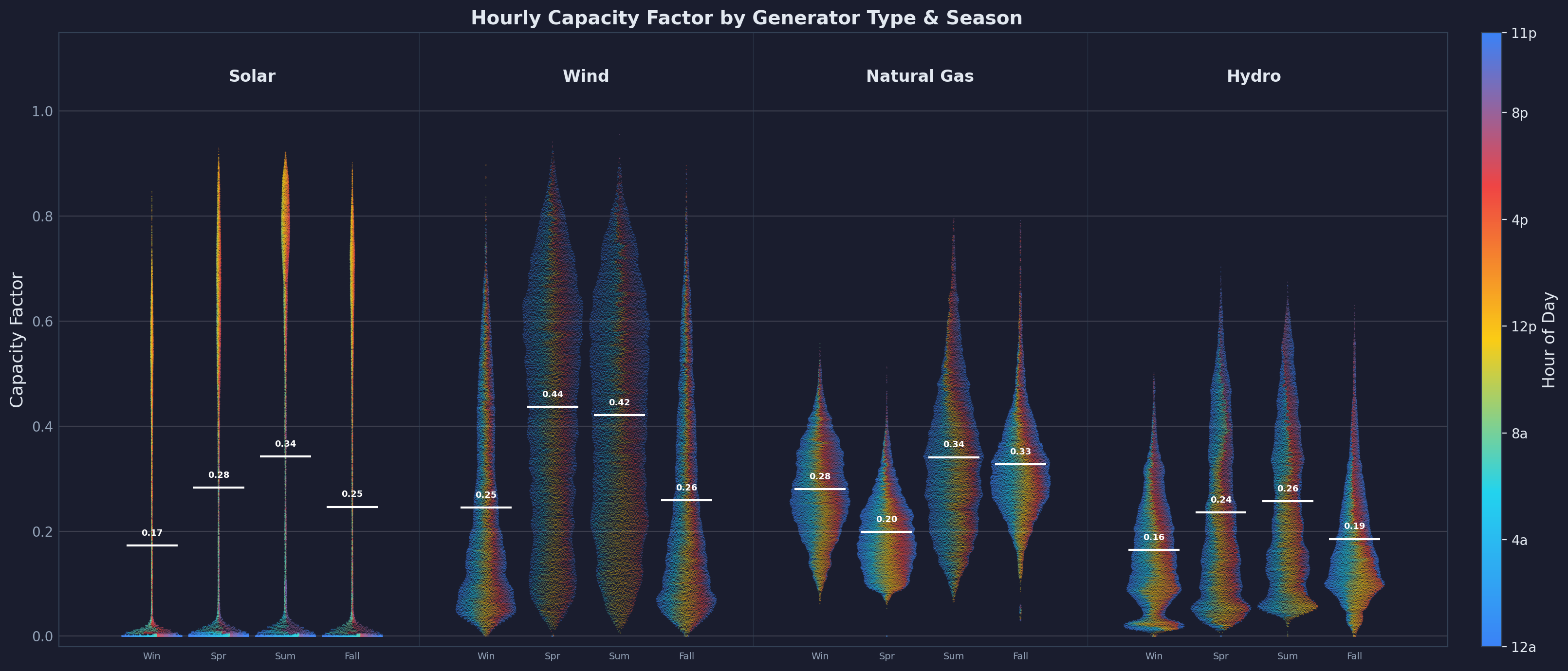
The data reveals stark differences across generator types. Nuclear power (not shown in the chart due to a near constant value over last six years) operates at approximately 90% capacity factor year-round, fulfilling its role as constant baseload generation. This high utilization reflects nuclear's economics: massive capital costs but low fuel costs make it profitable to run continuously. Solar energy averages just 25% capacity factor, with summer peaks around 34% and winter troughs near 17%. This reflects the fundamental constraint of daylight—solar can only generate during roughly 30-40% of hours, and even then, output varies with weather and sun angle. The data points being colored by the time of the day shows how high solar capacity factors naturally are in afternoon hours.
Wind power demonstrates a different pattern, achieving 35% average capacity factor with highest performance in spring and summer when weather fronts are most active. Large hydro shows strong seasonal variation (16-26% capacity factor), driven by snowmelt patterns and reservoir management—spring runoff enables high generation while summer drought constrains output. Natural gas operates at 20-34% capacity factor, varying seasonally to follow demand patterns. This moderate utilization reflects gas's role as a flexible, marginal resource that ramps up during peak hours and ramps down when renewables are abundant.
These capacity factor patterns have profound implications for grid planning. A grid powered entirely by solar would require roughly 4× the nameplate capacity compared to nuclear to deliver the same annual energy. However, solar's capital costs are far lower, and unlike nuclear, solar output peaks during midday when demand is often highest in summer. The challenge is evening demand, when solar falls to zero but electricity use remains high—a problem batteries increasingly solve.
2.2 Capacity Factors vs. Electricity Prices
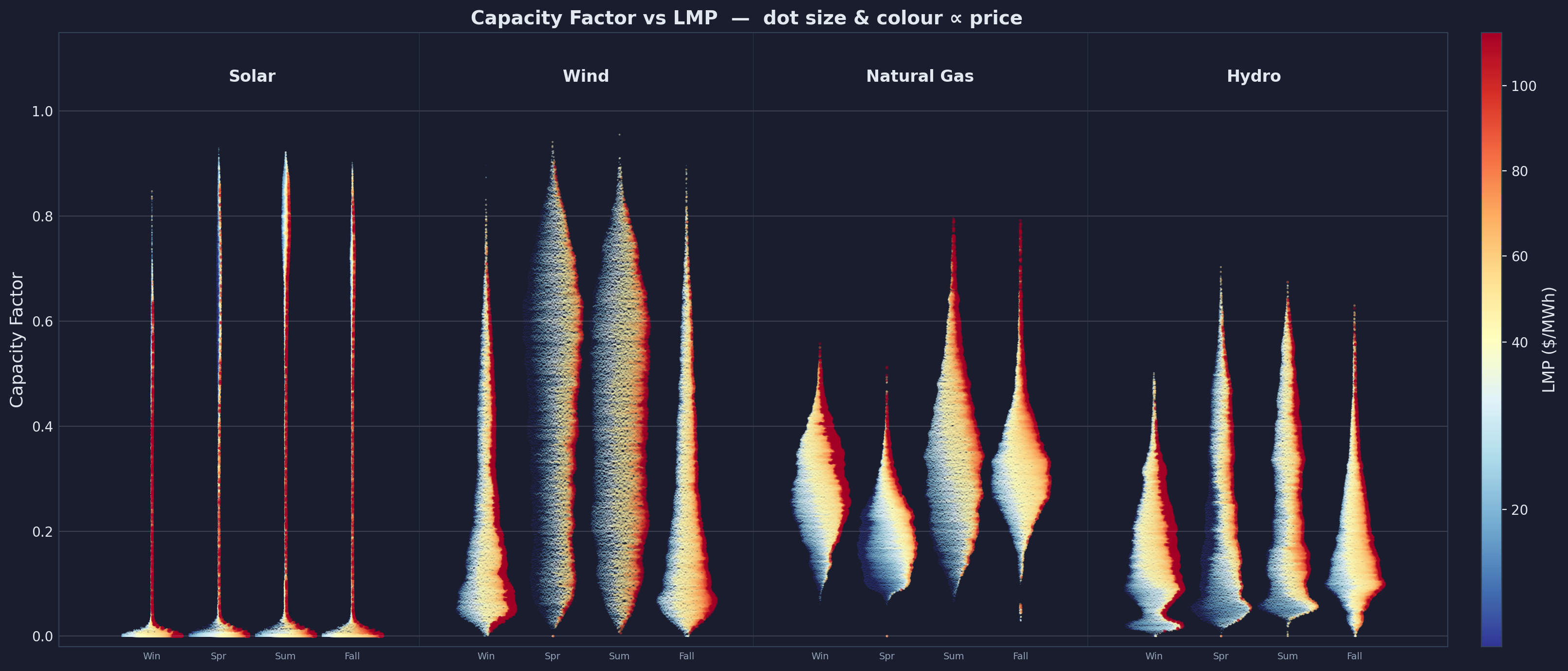
Correlating capacity factors with Locational Marginal Prices (LMP) exposes the economic dispatch order. Higher natural gas capacity factors coincide with elevated prices, revealing that gas plants are dispatched during peak demand when prices are high. Conversely, solar capacity factor peaks (midday) often correspond with lower prices due to abundant clean energy. This price-capacity relationship drives battery arbitrage economics: batteries charge when solar is abundant (high solar capacity factor, low prices) and discharge during evening peaks (high gas capacity factor, high prices).
The relationship between capacity factor and price is not coincidental—it reflects merit order dispatch, where generators are called upon in order of increasing marginal cost. Solar and wind have near-zero marginal costs (no fuel), so they run whenever available, often driving prices down. Natural gas has moderate marginal costs (~$30-50/MWh depending on gas prices), so it's dispatched when needed but curtailed when cheap renewables are available. This creates the price spreads that make battery storage economically viable, at least until batteries become so abundant that they cannibalize their own arbitrage opportunities.
3. Ramp Rates: Grid Flexibility Requirements
While capacity factors tell us how much energy different generators provide, ramp rates reveal their flexibility—the critical capability needed to balance California's increasingly variable renewable supply.
3.1 Ramp Rate Distributions
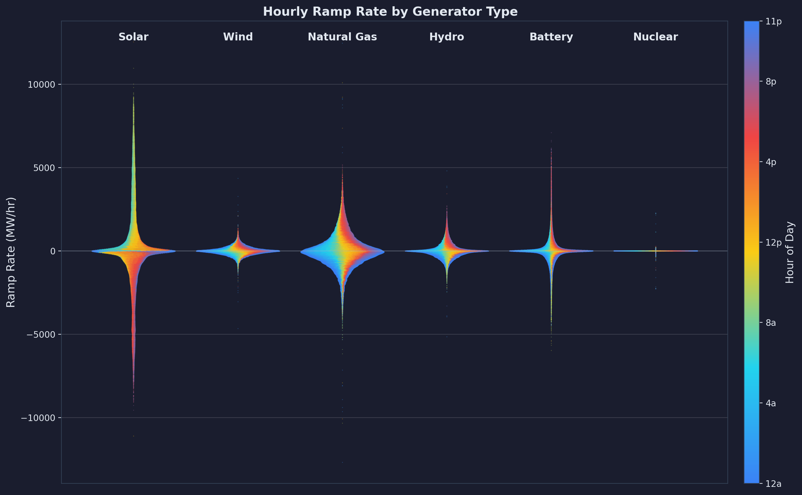
These distribution plots, derived from EIA-930 hourly generation data spanning 2020-2025, show the probability density of ramp rates for each generator type. For each hour, we calculate the change in generation (ΔP = P(t+1) - P(t)) and plot the distribution of these changes. The width of each "violin" at any vertical position indicates how frequently that ramp magnitude occurs.
The violin plots are colored based on time of day, so solar's ramp up (positive values) and ramp down (negative values) are distinctly colored, corresponding to morning and evening hours respectively. In contrast, the distribution for hydro, natural gas, and batteries shows less time-of-day distinction (although high positive battery ramps occur mostly during evening hours when discharging to meet peak demand). The width of each violin denotes data density at that ramp rate—wider sections indicate more frequent occurrence. Nuclear, solar, and wind are notably stretched horizontally (wider at low ramp rates), reflecting that these generators spend significant time at low or zero ramp rates: flat supply for nuclear, zero supply at night for solar, and calm periods for wind. Natural gas, by comparison, shows less horizontal stretch because it serves flat load less often, instead ramping frequently to follow demand.
Importantly, the ramp rates shown here reflect actual operational patterns, not the inherent ramp capability of each generator type. Batteries, natural gas, and hydro can actively follow demand and ramp on command. Solar and wind, however, are bound to natural cycles—they ramp when the sun rises/sets or when weather fronts move, not in response to grid needs.
Solar exhibits the most extreme ramp behavior, with changes reaching 10,000+ MW per hour during sunrise and sunset transitions. These massive ramps reflect California's 15+ GW of solar capacity ramping up collectively each morning and down each evening. Cloud cover can cause rapid swings within minutes, though hourly data smooths these fluctuations. Battery storage demonstrates remarkable ramp capability—up to 6,000 MW/hour—making batteries the ideal resource for balancing solar's variability. Unlike gas plants that need minutes to hours to start and ramp, batteries respond in milliseconds.
Natural gas provides moderate flexibility, typically ramping at 1,000-3,000 MW/hour. This flexibility is crucial for following load and renewable variability, but gas cannot match the speed of batteries. Combined-cycle plants take 30-60 minutes to start and can only ramp a few percent of capacity per minute. Nuclear and large hydro show minimal ramping, with most changes under 500 MW/hour. Nuclear plants are designed for steady baseload operation—frequent ramping causes thermal stress and shortens component life. Large hydro can technically ramp faster but often operates under environmental constraints that limit rapid reservoir releases.
Wind shows moderate ramp rates (1,000-3,000 MW/hour) driven by weather front movements. Unlike solar's predictable daily cycle, wind ramps are more stochastic, occurring when storm systems arrive or depart. This unpredictability makes wind harder to integrate than solar without adequate flexible resources.
3.2 Ramp Rates vs. Electricity Prices
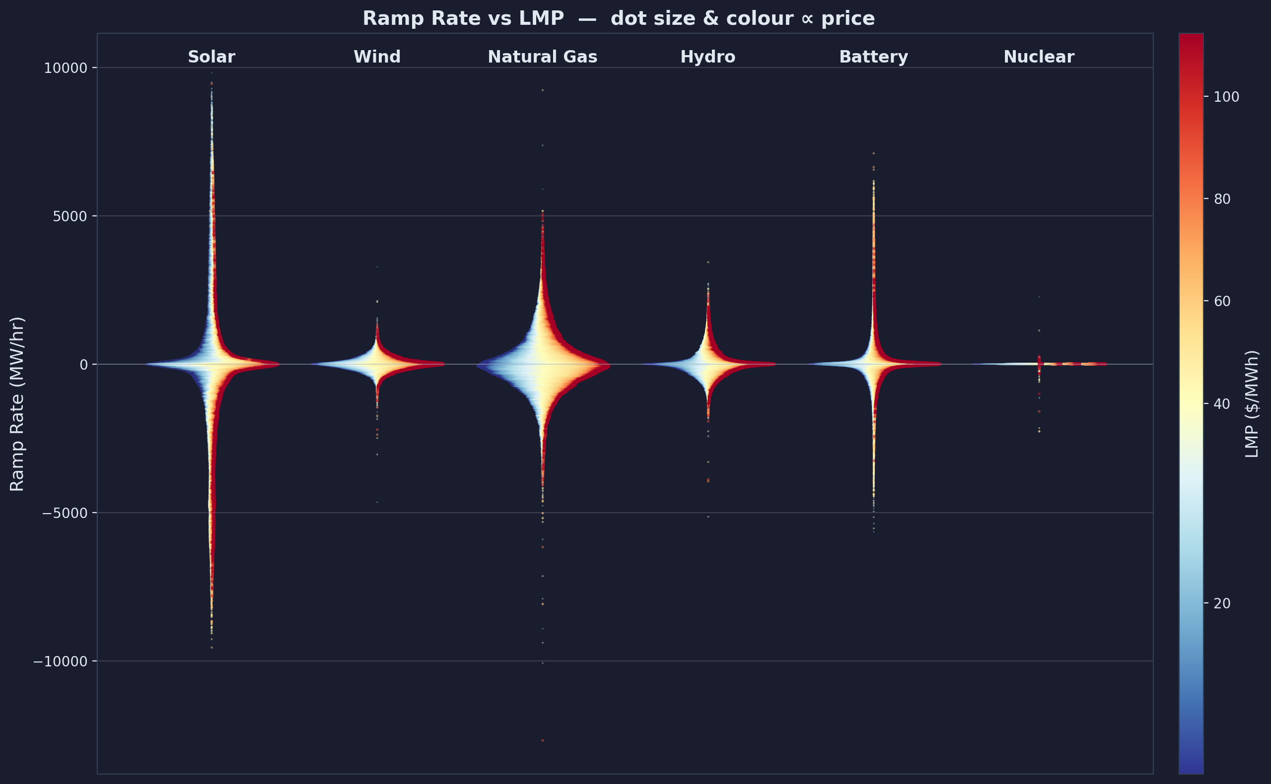
Because solar and wind cannot respond to demand as well as natural gas and batteries, their ramping doesn't correlate with electricity prices. For example, when solar ramps down rapidly at sunset, gas generators must ramp up quickly to fill the gap. This sudden demand for flexible capacity drives prices up, sometimes dramatically. Similarly, morning solar ramps can suppress prices rapidly, creating negative price events if gas plants cannot curtail fast enough.
Battery ramps show particularly strong correlation with price volatility. Batteries respond to arbitrage opportunities: charging rapidly when prices crash (solar oversupply) and discharging rapidly when prices spike (evening peak). This behavior is visible in the scatter plot as battery ramps cluster during high-price periods. The economic implication is clear: the grid values flexibility, and batteries' exceptional ramp capability positions them to capture that value. This high ramp capability also explains batteries' dominance in ancillary service markets, where rapid response is the primary requirement.
4. Solar's Impact: The Duck Curve Phenomenon
As solar capacity exploded in California, the grid began exhibiting a distinctive daily pattern known as the "duck curve." This shape emerges from the interaction between demand, solar generation, and the resulting "net load" (demand minus renewables) that conventional generators must meet.
4.1 Duck Curve Evolution: April 2020-2025
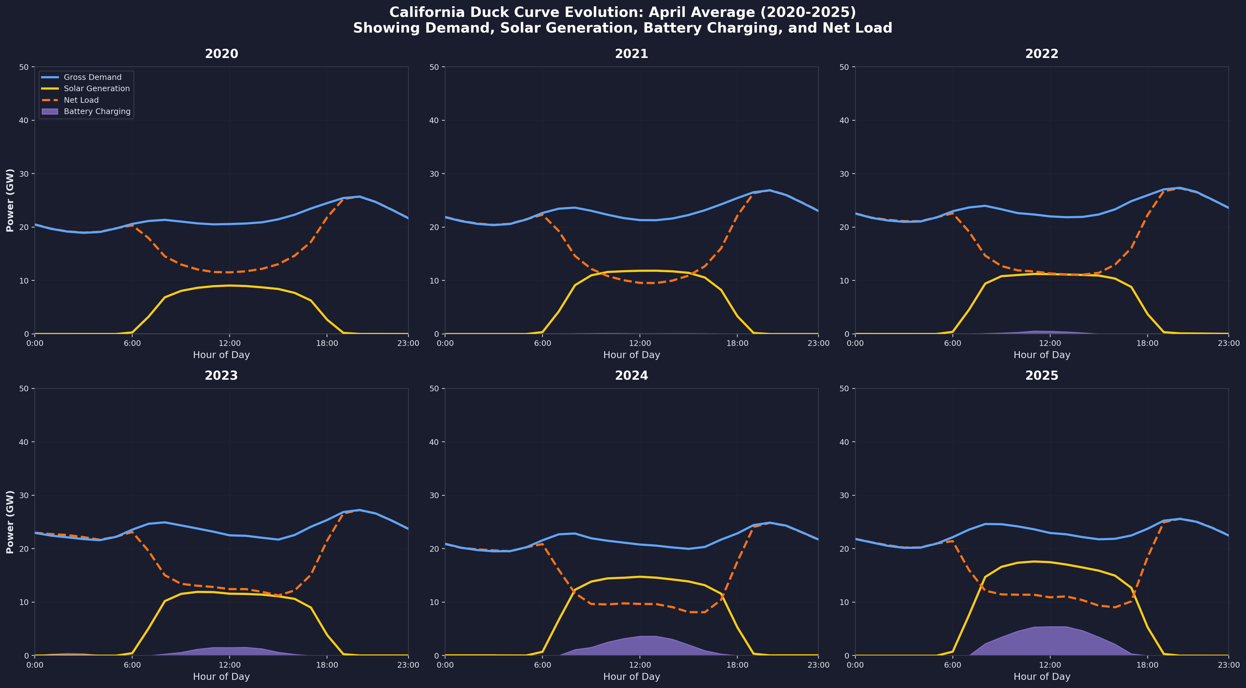
We examine April specifically because spring months showcase the duck curve most dramatically—moderate demand combines with high solar generation to create extreme patterns. The data comes from CAISO's 5-minute fuel-source data, averaged hourly across all April days for each year. Gross demand represents the sum of all generation sources, excluding battery charging (which is load, not supply). Solar generation comes directly from CAISO's solar column. Battery charging appears as negative battery values—when batteries charge, they consume power rather than providing it. Net load is calculated as gross demand minus solar plus battery charging, representing the residual load that non-solar generators must meet.
From 2020 to 2023, the duck curve "belly" deepened each year as solar capacity grew. Net load dropped from approximately 20 GW at midday in 2020 to just 12 GW by 2023. This created a severe challenge: as the sun sets, net load climbs from 12 GW at 3pm to 28 GW by 7pm—a ramp of 16 GW in 4 hours, or 4,000 MW per hour. Gas generators struggled to provide this ramp reliably, especially on hot summer evenings when air conditioning demand peaked simultaneously with solar's decline.
The battery impact becomes visible in 2024-2025. The purple shaded area shows battery charging during solar surplus hours, absorbing 2-4 GW of excess midday solar. This accomplishes two critical functions: first, it reduces negative prices by consuming solar that would otherwise be curtailed; second, it stores energy for evening discharge, smoothing the sunset ramp. By 2025, the duck curve begins to flatten as batteries fill the belly during midday charging and shave the neck during evening discharge. The net load curve—the orange dashed line—shows less extreme ramping in 2025 compared to 2023, demonstrating batteries' grid-balancing effect.
4.2 Negative Price Events
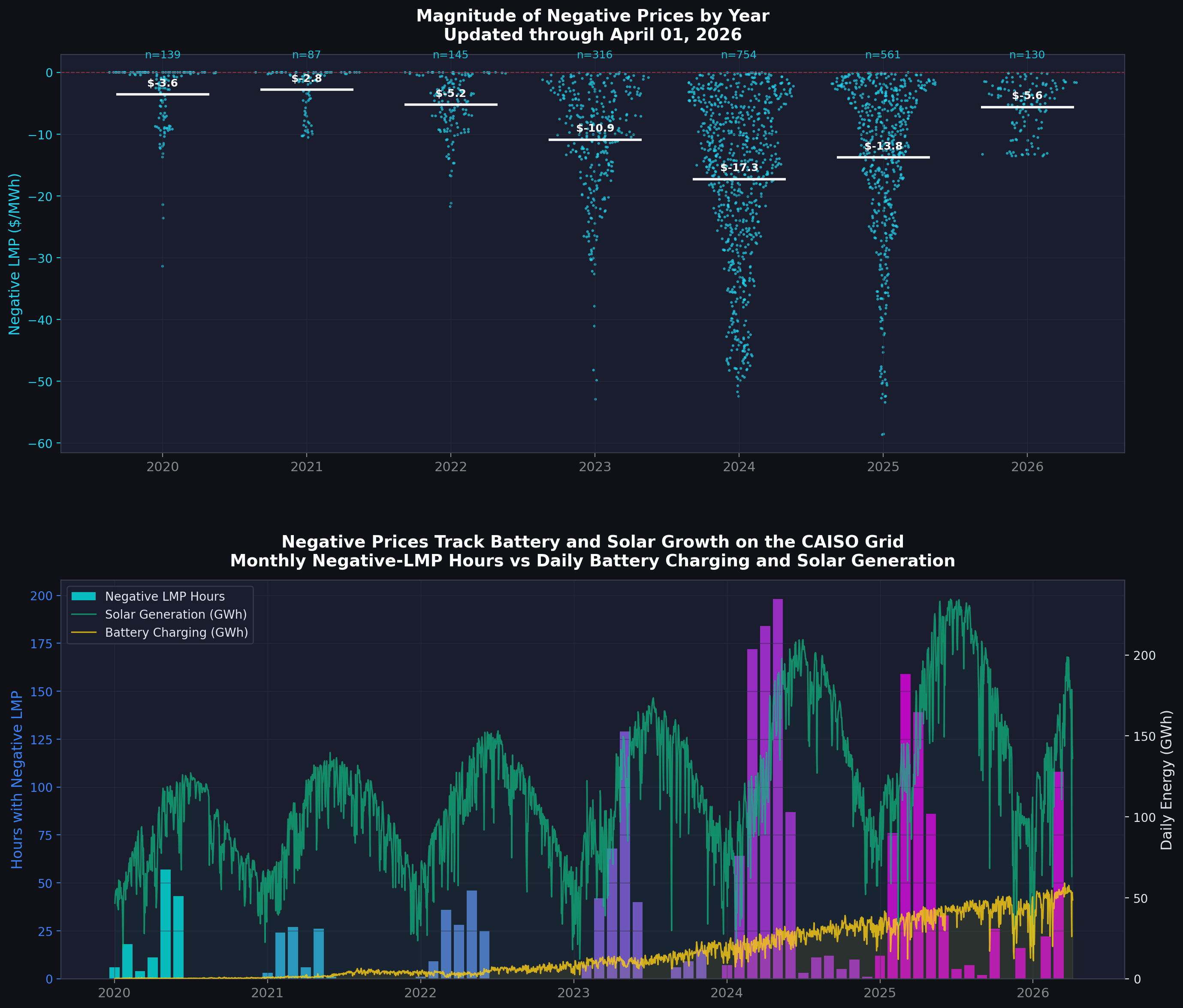
Negative price events—hours when day-ahead LMP falls below $0/MWh—emerged as a major grid problem from 2020 to 2024. These events track CAISO's pricing data correlated with solar generation levels, seasonal patterns, and minimum price magnitudes reached each year.
From 2020 to 2023, negative price hours increased exponentially. In 2020, roughly 500 hours experienced negative prices. By 2023, this surged to approximately 3,000 hours, with the worst prices reaching -$30 to -$50/MWh. The root cause was straightforward: solar generation exceeded demand during spring midday hours, but must-run nuclear and hydro plants could not curtail, gas generators had already reached minimum output, and limited export capacity to neighboring states prevented dumping excess power. Generators paid the grid to accept their electricity rather than shut down and lose their day-ahead energy market position or incur restart costs.
2024 marked the peak of the crisis—negative price hours climbed to approximately 3,500, the worst year on record. But then came a dramatic reversal. In 2025, battery storage capacity reached critical mass at 10-11 GW, and negative price hours plummeted to around 1,500—a 57% reduction from the 2024 peak. Price magnitudes also softened, rarely dipping below -$20/MWh. Batteries absorbed 2-4 GW of excess solar during price crashes, converting the problem into an arbitrage opportunity. This demonstrates how storage doesn't just shift energy in time—it fundamentally changes market dynamics by monetizing what was previously waste.
5. Battery Storage Revolution
Between 2020 and 2025, California deployed utility-scale battery storage at an unprecedented rate, fundamentally transforming grid operations. From negligible capacity in 2020, batteries grew to 11 GW by 2025—representing up to 65% of peak demand on some days.
5.1 Battery Capacity Growth vs. LMP
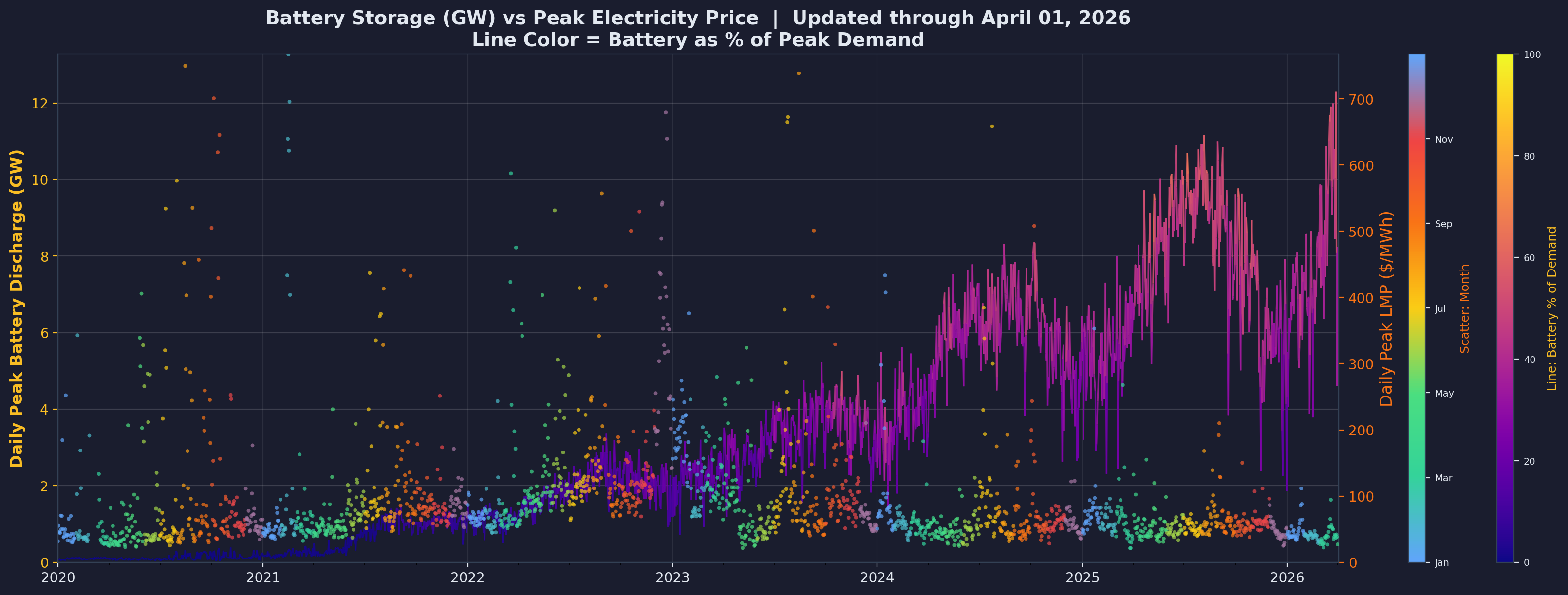
This visualization tracks daily peak battery discharge in GW against day-ahead electricity prices, with the line colored by battery percentage of peak demand—a plasma gradient from purple (0%) through orange to yellow (100%). The data comes from CAISO's 5-minute battery generation data, with daily peak discharge calculated as the maximum positive battery MW value each day divided by 1,000 to convert to GW.
The exponential growth is unmistakable: battery discharge capacity grew from approximately 0.5 GW in 2020 to 11 GW in 2025. The line color evolution tells a parallel story. In early years (purple), batteries represented less than 5% of peak demand—a novelty resource with minimal grid impact. By 2024-2025, the line shifts to orange, indicating batteries reaching 40-65% of peak demand on many days. This scale transformation elevated batteries from niche technology to critical infrastructure.
The price correlation is equally striking. In 2020-2022, LMP spikes above $100/MWh were common, with occasional excursions above $500/MWh during heat waves or reliability events. By 2024-2025, these extreme spikes largely disappear. Batteries smooth price volatility by providing peak capacity exactly when needed—evening hours, hot days, and unexpected outages. The grid becomes more reliable not through traditional fossil fuel peakers but through rapidly responding, emissions-free storage.
5.2 Battery Discharge vs. LMP by Year
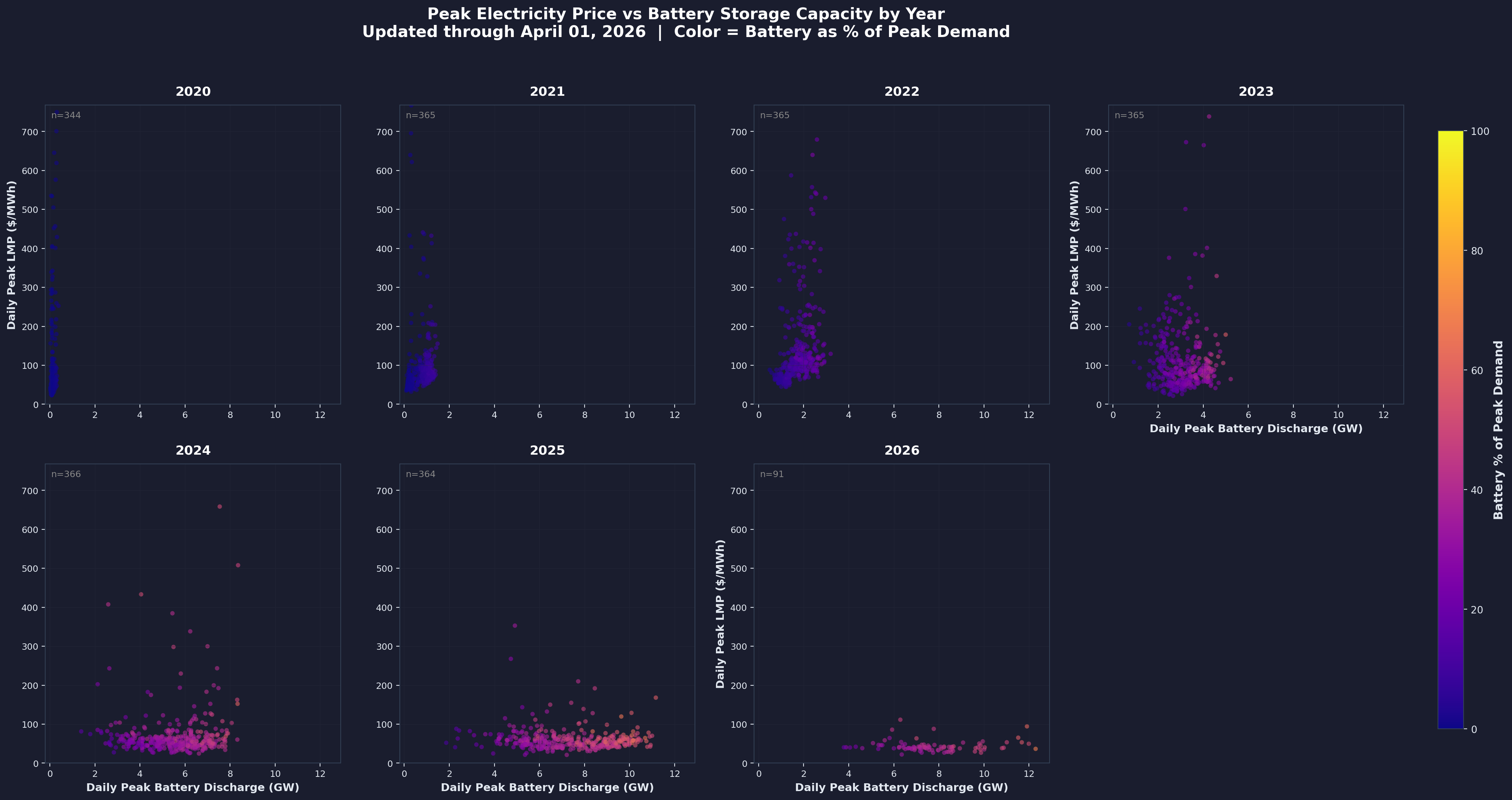
Breaking the analysis into yearly scatter plots reveals the market's structural evolution. Each subplot plots daily peak battery discharge (GW) on the x-axis against daily peak LMP on the y-axis, with y-axis capped at the 99th percentile for readability. Points are colored by battery percentage of peak demand using the plasma colormap.
The peak LMP values are colored by time of year. One can observe that in 2020-2023, the extremely high peak LMP values occurred across all colors (i.e., throughout the year), while more recently they are limited to winters (when natural gas prices are higher) and summers (when demand is maximum).
2020-2022 shows a tight cluster at low GW, with prices ranging wildly from $20 to $800/MWh. The grid had minimal battery capacity, so prices remained highly volatile, driven primarily by gas plant availability and heat wave conditions. 2023 marks a transition—horizontal spreading begins as battery capacity grows to 2-6 GW, though price volatility persists.
The major transformation occurs in 2024-2025. Batteries spread across the full 0-11 GW range, and high price events above $500/MWh largely disappear. Orange dots indicate days when batteries met 40-65% of peak load—previously unimaginable. A price ceiling effect becomes visible: LMP rarely exceeds $200/MWh even on high-discharge days, because batteries cap prices by providing abundant supply at marginal cost near zero (they're already built; discharging costs almost nothing).
This creates a paradox for battery developers: as batteries flatten price spikes, price spreads narrow, reducing future arbitrage revenue. Early projects captured enormous arbitrage value—buying power at -$20/MWh and selling at $200/MWh—but later projects face compressed spreads of $20/MWh to $80/MWh. This "winner's curse" drives developers to seek alternative revenue streams: capacity payments, ancillary services, or federal tax credits from the Inflation Reduction Act.
6. Grid Economics: Price Cannibalization in Ancillary Services
As battery capacity saturated the market, an economic phenomenon emerged: price cannibalization. Batteries eat their own lunch—their very success in smoothing prices reduces the price spreads that make them profitable. Beyond energy arbitrage, this cannibalization devastated ancillary service markets.
Ancillary services maintain grid reliability: Regulation Up (RU) increases generation to maintain frequency when demand exceeds supply; Regulation Down (RD) decreases generation when supply exceeds demand; Spinning Reserve (SR) provides backup generation that can come online within 10 minutes; Non-Spinning Reserve (NR) provides backup within 10-30 minutes. Traditionally, gas plants and hydro dominated these markets. Batteries' exceptional ramp rates position them to outcompete incumbents—but with consequences.
The following four charts track battery capacity growth (colored line, plasma gradient by % of demand) against ancillary service prices (scatter points, colored by month/season). Each visualization uses daily peak prices capped at the 99th percentile for readability.
6.1 Regulation Up (RU)
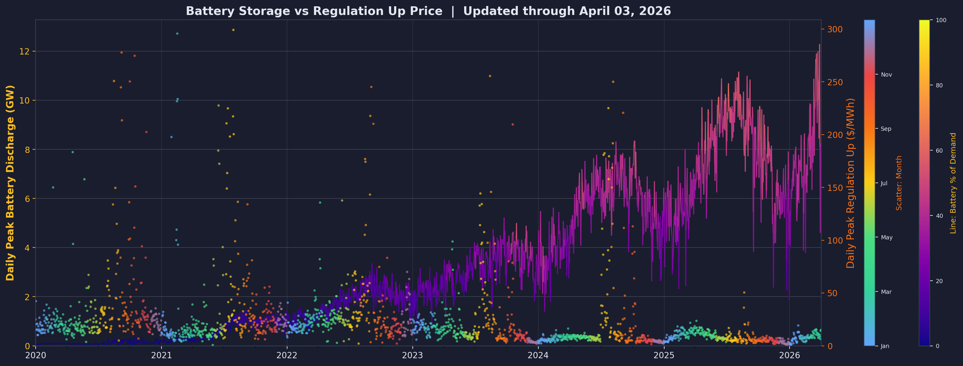
Regulation Up prices reveal the most dramatic collapse. From 2020 to 2022, prices regularly spiked to $200-$300/MWh as the grid paid premium rates for fast-responding upward capacity. Gas plants and hydro provided this service, but slowly—taking seconds to minutes to respond to automatic generation control signals. Batteries respond in milliseconds, making them vastly superior.
As the battery capacity line (colored purple to yellow) climbs from under 1 GW to 11 GW, RU prices compress to $20-$100/MWh by 2024-2025. The scatter points shift from high (orange/red in early years) to low (green/blue in recent years), especially during spring and fall when moderate weather reduces grid stress. Early battery projects captured $200+/MWh for RU; later projects face $50/MWh or less. This 60-75% revenue decline forced developers to rethink business models—capacity payments and tax credits became essential, not optional.
6.2 Regulation Down (RD)
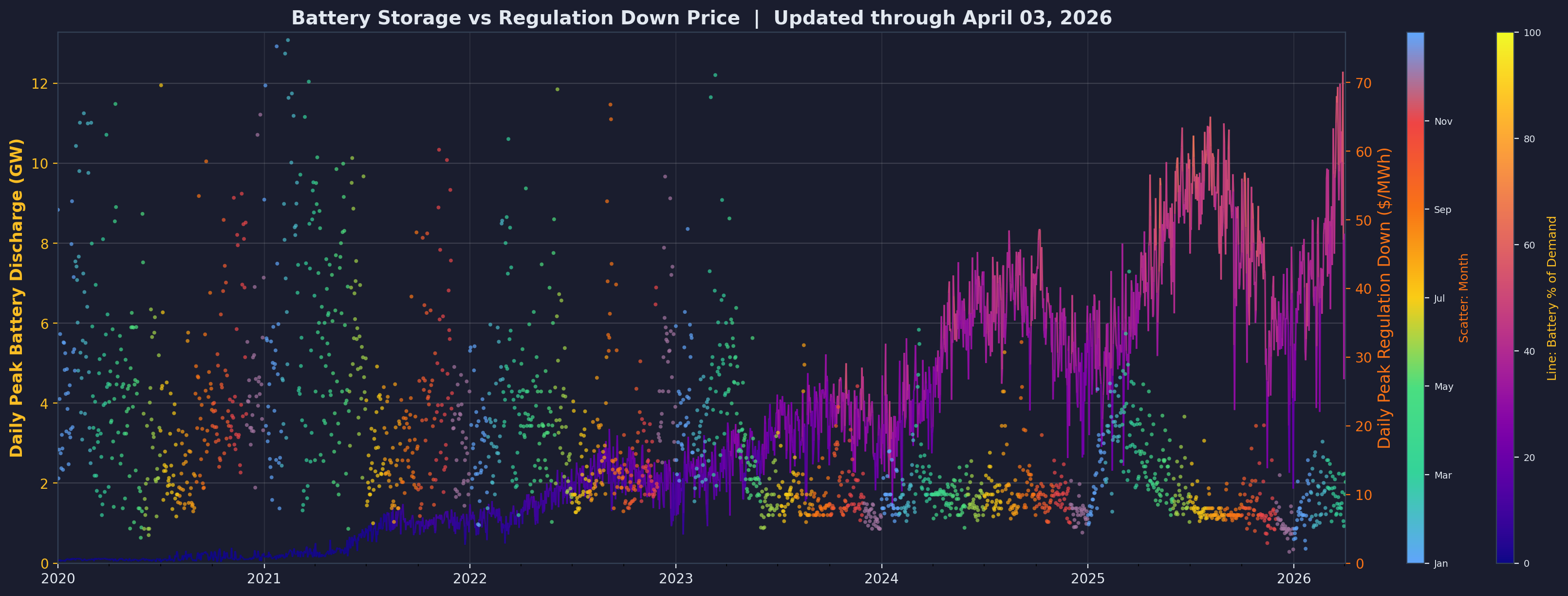
Regulation Down experienced similar but even more severe cannibalization. Prices dropped from a $50-$150/MWh range in 2020-2022 to $10-$50/MWh by 2025. The RD market is particularly vulnerable because batteries excel at rapid downward response—stopping discharge or beginning charge within milliseconds. Gas plants must reduce fuel flow and adjust turbine blades, taking 10-30 seconds. Batteries' superior performance flooded the market, driving prices to commodity levels.
The seasonal color pattern (winter blue → spring green → summer yellow → fall orange in the scatter points) reveals that RD prices remain slightly elevated in summer when grid stress is highest, but even these peaks diminished as battery capacity grew. By 2025, even summer RD prices rarely exceeded $100/MWh, whereas in 2020 they regularly hit $150-200/MWh.
6.3 Spinning Reserve (SR)
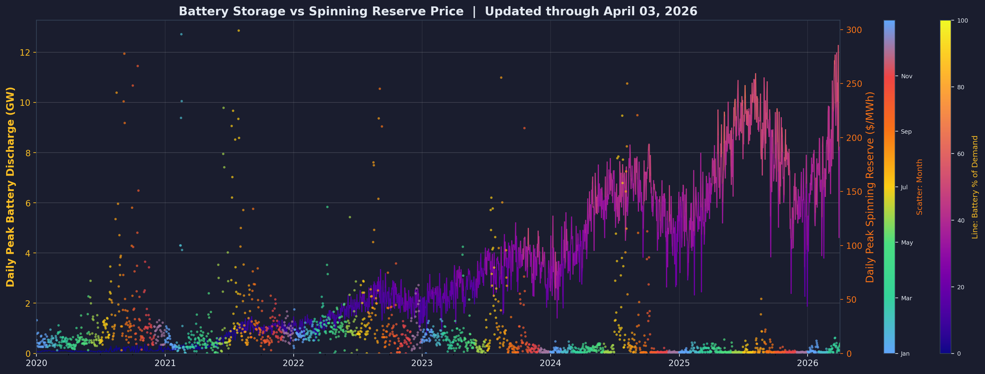
Spinning Reserve prices collapsed from $200-$300/MWh peaks in 2020-2021 to under $100/MWh by 2025. SR requires generators to be online and synchronized with the grid, ready to provide full power within 10 minutes. Gas plants traditionally provided SR by running at partial load, burning fuel continuously to stay synchronized. Batteries provide SR at near-zero marginal cost—they sit idle when fully charged, consuming nothing, yet can provide full discharge within seconds.
The economic advantage is overwhelming. A gas plant providing 100 MW of SR might burn $1,000/hour in fuel to maintain synchronization. A battery providing 100 MW of SR burns zero fuel. As battery capacity exploded (yellow line rising to 11 GW), SR prices had nowhere to go but down. This benefited electricity consumers through lower grid costs but devastated the economics of later battery projects that relied on SR revenue projections from 2020-2022.
6.4 Non-Spinning Reserve (NR)
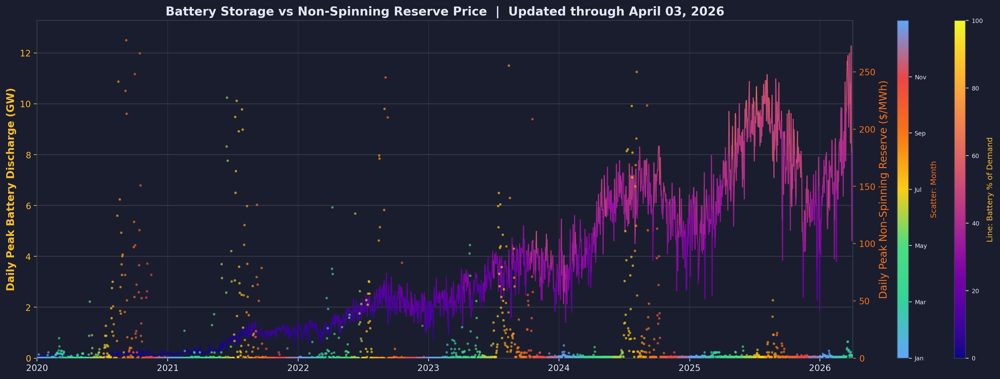
Non-Spinning Reserve proved slightly more resilient but still suffered dramatic price erosion. NR requires generators that can come online within 10-30 minutes—traditionally, this meant gas plants in "hot standby" mode or hydro plants with water ready. Prices ranged from $50-$200/MWh in 2020-2022, with peaks during reliability events. By 2025, prices compressed to $20-$80/MWh.
NR declined less severely than RU/RD because it values different attributes: long response time (10-30 min) and sustained duration (hours). Batteries excel at short bursts but deplete quickly. However, as 4-hour batteries became standard, even NR faced saturation. The market distinguished less between spinning and non-spinning reserves when batteries could provide both services simultaneously from a single asset.
The combined impact across all ancillary services is sobering: early battery projects (2020-2022) achieved total ancillary service revenues of $100-150/kW-year. By 2025, this declined to $30-60/kW-year—a 60-70% reduction. Projects increasingly rely on capacity payments (fixed payments for availability) and IRA Section 48E investment tax credits (30-50% of capital cost) to achieve acceptable returns. The era of batteries thriving on energy arbitrage and ancillary services alone has ended; policy support became essential to maintain deployment rates.
7. Renewable Penetration Progress
California set aggressive targets for renewable energy penetration. By tracking hourly renewable penetration and counting hours above 100%, we can measure progress toward 24/7 clean energy.
7.1 Hourly Clean Energy Penetration (2020-2025)
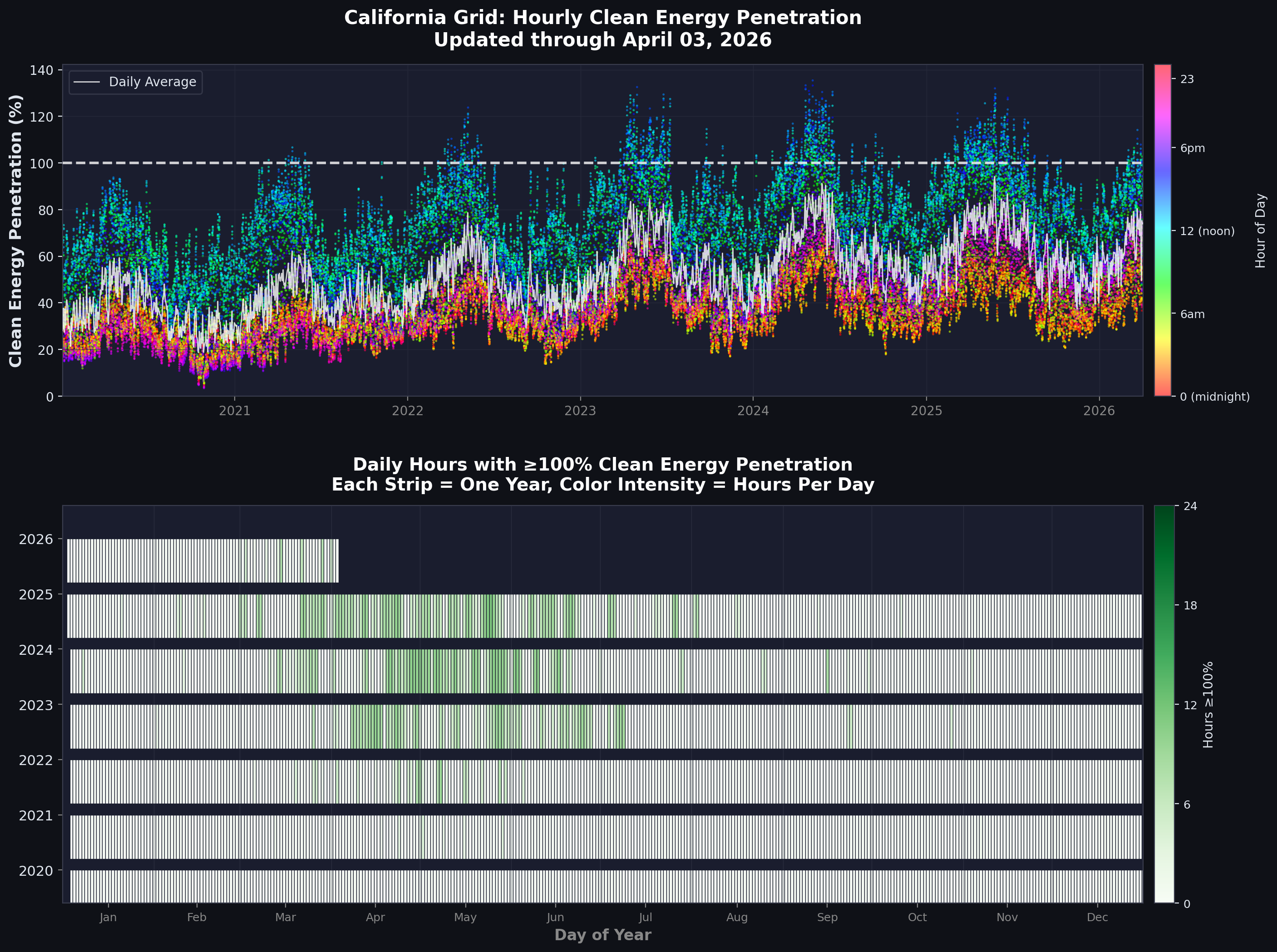
This dual-panel visualization tracks California's journey toward continuous clean energy. The data source is CAISO's 5-minute fuel-source data spanning 2020-2025. Clean energy includes renewables (solar, wind, geothermal, biomass, biogas, small hydro), nuclear, large hydro, and battery discharge—essentially all non-fossil generation. Gross demand represents total California consumption (all generation minus battery charging). Clean energy penetration is calculated as clean energy MWh divided by gross demand MWh, multiplied by 100 to get percentage.
Panel 1 shows hourly penetration as a scatter plot with 48,000+ data points (one per hour over six years). Each dot is colored by hour of day using an HSV colormap: red indicates midnight, cyan is 6am, yellow is noon, orange is 6pm. This color scheme reveals the diurnal pattern instantly—yellow/green dots (midday) regularly exceed 100% due to solar abundance, while blue/purple dots (night) cluster at 20-40%, limited to wind, hydro, nuclear, and battery discharge. Orange/red dots (evening) show the challenging transition period at 30-60% as solar declines but demand remains high.
The white line tracks daily average penetration, providing a clearer trend through the scatter. In 2020, daily average clean penetration hovered around 45%. By 2023, this climbed to approximately 55%. In 2025, it reached roughly 65%—a 20 percentage point gain in five years. The 100% threshold (white dashed line) serves as a benchmark for self-sufficiency. Hours above this line indicate California generated more clean electricity than it consumed, exporting surplus or using it to charge batteries.
Panel 2 presents a calendar heatmap showing daily hours at or above 100% penetration, with color intensity (green scale) indicating hour count from 0 to 24. The transformation is striking. In 2020, very few days achieved any 100% hours—the calendar remains mostly light colors. By 2023, spring and summer show sporadic 2-4 hour days in medium green. In 2024-2025, the best spring days achieve 8-11 hours at 100%+ (dark green), with consistent 5-7 hour days throughout spring and early summer. The record: May 24, 2025 achieved 11 consecutive hours at 100%+ clean energy, from approximately 10am to 9pm.
Seasonal patterns emerge clearly from the heatmap. Spring (March-May) shows peak performance—high solar generation combines with moderate demand as California's mild weather reduces heating and cooling loads. Summer (June-August) maintains good performance despite higher demand because extreme solar output compensates. Winter (December-February) shows the worst performance, with short days and low solar angle limiting renewable generation while heating demand increases consumption.
The remaining challenge is starkly visible: achieving 100% during night hours requires fundamentally different resources than those that enable daytime success. Current 4-hour batteries extend solar into early evening but cannot bridge overnight periods. Reaching 24/7 clean energy requires longer-duration storage (8-16 hour batteries or other technologies), expanded transmission to access remote wind resources in Wyoming or New Mexico, demand flexibility to shift loads like EV charging and industrial processes to match generation, and firm clean resources like enhanced geothermal, next-generation nuclear, or green hydrogen to provide multi-day reliability during winter storms or heat waves.
8. Natural Gas Decline
As renewables and batteries grew, natural gas—California's largest fossil fuel source—entered structural decline.
8.1 Natural Gas Generation Over Time
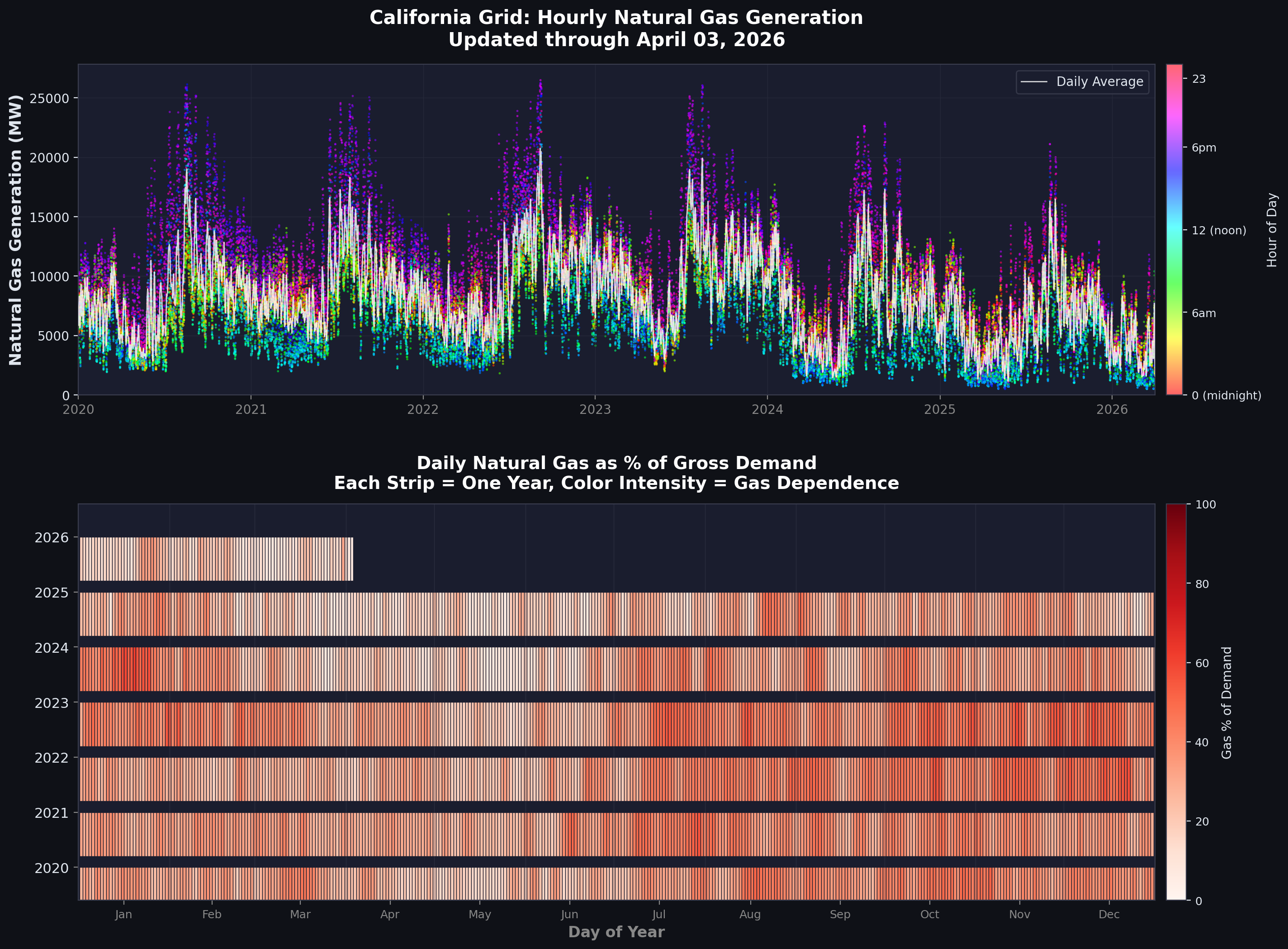
This dual-panel visualization tracks natural gas generation using CAISO fuel-source data. Panel 1 shows hourly natural gas generation in MW with each point colored by hour of day (HSV colormap). The white line tracks daily average gas generation. Panel 2 displays a calendar heatmap showing daily gas percentage of gross demand. For each 5-minute interval, gas percentage equals gas MW divided by gross demand MW, multiplied by 100, then averaged across the day. Red intensity indicates higher gas dependence.
The decline trajectory tells a complex story. In 2020, California averaged 8,406 MW of daily gas generation, representing 32.2% of demand. Unexpectedly, from 2021 to 2023, gas generation increased to 9,960 MW (37.3% of demand). This reflected demand growth outpacing renewable additions—heat waves, drought-constrained hydro, and nuclear plant outages forced greater reliance on gas. California's 2020 rolling blackouts during an August heat wave highlighted grid vulnerability, spurring both battery deployment and (temporarily) increased gas utilization for reliability.
The inflection point arrived in 2024. Gas generation dropped sharply to 7,447 MW (28.5% of demand). By 2025, it declined further to 6,188 MW (23.8% of demand). The total reduction from 2020 to 2025: 2,218 MW, a 26.4% decrease. This decline coincided with battery capacity reaching critical mass at 6-11 GW. Batteries displaced gas during evening peak hours—exactly when gas plants were most valuable and profitable. Continued solar growth further reduced midday gas requirements, though this effect was partially offset by negative price events forcing solar curtailment until batteries absorbed the surplus.
The calendar heatmap (Panel 2) visualizes this transition vividly. From 2020 to 2023, the calendar shows mostly orange and red colors (25-45% gas dependence). In 2024-2025, colors shift to yellow and light orange (15-30% gas). Spring days in 2025 appear green, indicating under 10% gas dependence on some of the cleanest days. Seasonal patterns persist: winter shows highest gas dependence (30-40%) due to low solar and high heating demand, while spring shows lowest gas use (10-20%) thanks to solar abundance and moderate weather.
This decline poses questions for California's remaining gas fleet. As batteries and renewables continue growing, gas plants operate fewer hours annually, reducing revenue while fixed costs persist. Some plants may become uneconomic and retire, potentially creating reliability concerns during extreme events when renewables and batteries prove insufficient. California grapples with how to maintain adequate flexible capacity as the economic case for gas plants erodes—capacity payments, resource adequacy requirements, and strategic reserves may become necessary to prevent premature retirements before alternatives fully mature.
9. Energy Mix Analysis
To understand California's true progress, we need a comprehensive view of where every MWh comes from.
9.1 Original Energy Breakdown
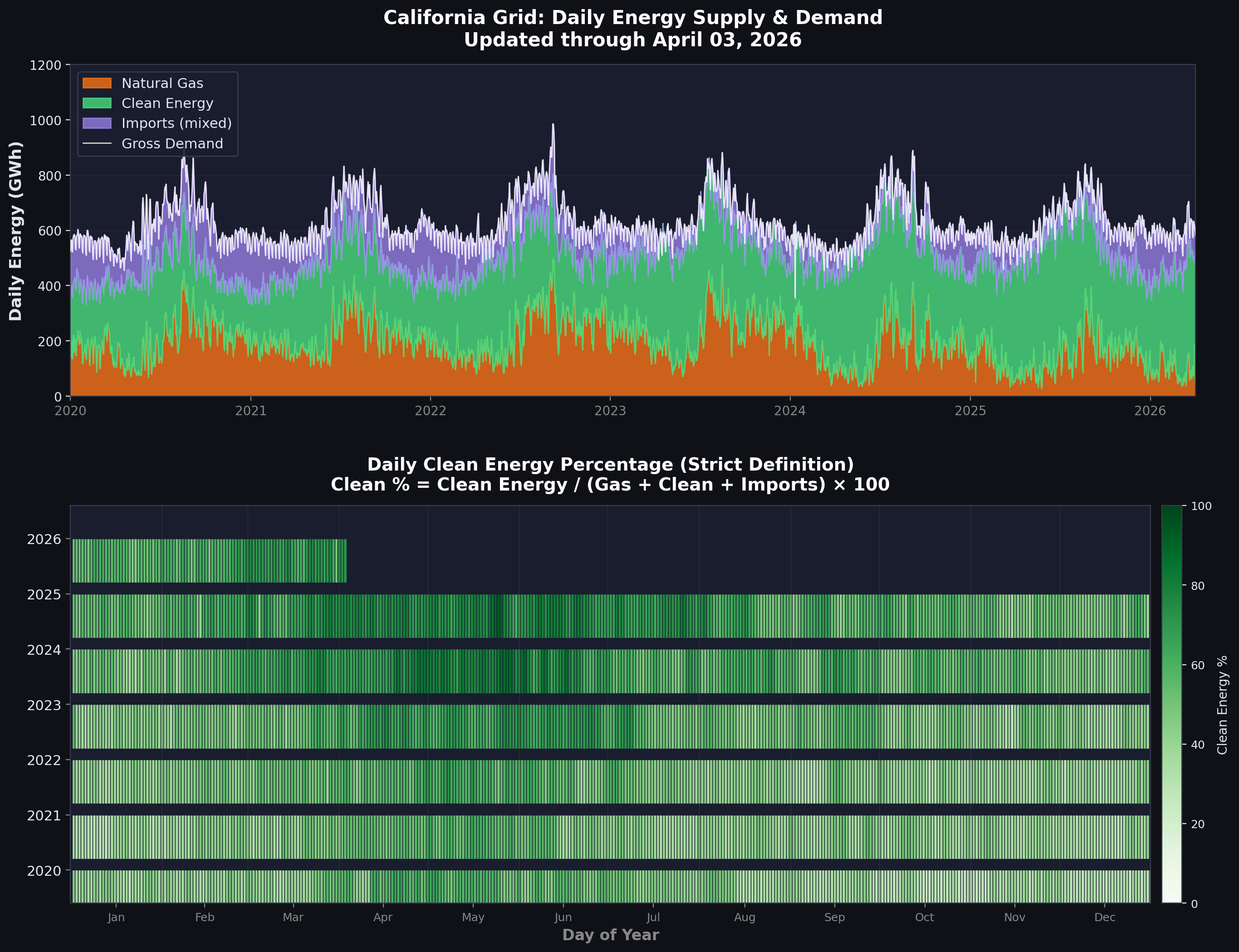
The original energy breakdown uses CAISO fuel-source data categorized into three groups: natural gas (CAISO in-state gas generation), clean energy (renewables, nuclear, large hydro, battery discharge), and imports (electricity from neighboring states with unknown composition). For each 5-minute interval, generation is summed by category and integrated to daily MWh (5-minute interval equals 1/12 hour). Gross demand equals all generation sources minus battery charging. Clean percentage is calculated as clean energy divided by the sum of gas, clean, and imports, multiplied by 100.
Panel 1 displays the stacked area chart. Natural gas (orange) averages roughly 200 GWh per day, declining toward 150 GWh by 2025. Clean energy (green) averages about 310 GWh per day, growing toward 400+ GWh in 2025. Imports (purple) average approximately 105 GWh per day, remaining stable but uncertain in composition. The white line traces gross demand, showing seasonal variation between 600-800 GWh per day with summer peaks driven by air conditioning.
Panel 2 shows the calendar heatmap of daily clean energy percentage. The color progression from light green (40-50% clean) in 2020 toward medium green (55-65% clean) in 2025 indicates steady progress. However, the calculated average clean energy percentage is 50.9%—decent but not exceptional given California's climate commitments.
The critical problem with this analysis: it treats all imports as "unknown," neither clean nor fossil. This understates California's clean energy progress because reality differs from accounting. Most imports come from the Pacific Northwest (Washington and Oregon, dominated by hydro) and the Southwest (Arizona, Nevada, New Mexico, increasingly solar-rich). Only a minority of imports are fossil fuels, yet this methodology assigns zero credit for clean imports while implicitly penalizing California for not generating everything in-state. This conservative approach made sense before detailed import data became available, but with EIA interchange data and CEC import mix reports, we can do better.
10. Import Classification Methodology
The critical question: what are we importing? Is it clean hydro from the Northwest or coal from the Southwest? The answer dramatically changes California's clean energy percentage.
10.1 Data Sources and Merit Order Dispatch Model
The challenge is straightforward: CAISO reports total imports but doesn't break down by fuel source. Power flows across state lines without labels. To solve this, we developed a merit order dispatch model using two data sources. First, EIA Interchange Data (2019-2024) provides hourly import flows from Northwest (NW) and Southwest (SW) regions into CAISO. Second, California Energy Commission (CEC) Import Mix Data gives annual breakdown of generation sources in NW and SW export regions: coal, natural gas, oil, nuclear, large hydro, small hydro, geothermal, solar, wind, biomass, unspecified, and other. Each source is reported as GWh per year by region.
The merit order dispatch model simulates how power is dispatched to meet CAISO's import demand, following economic logic. We define dispatch priority from cheapest/cleanest first to most expensive last:
- Priority 1: Nuclear, geothermal, large hydro, small hydro, solar, wind (must-run or zero marginal cost)
- Priority 2: Other
- Priority 3: Coal
- Priority 4: Unspecified (market purchases)
- Priority 5: Natural gas (marginal resource)
- Priority 6: Oil
For each source and region, the model initializes capacity using default capacity factors, then simulates hourly dispatch following merit order and availability constraints. Solar availability is modeled using a simple sine curve peaking at 1pm and zero at night. We iteratively adjust capacity until annual generation matches CEC targets within 0.1% tolerance. Once capacities are calibrated, the model dispatches available generation each hour to meet import demand, calculating hourly generation by source.
Carbon intensity is calculated using source-specific emission factors: coal at 1000 kg CO₂/MWh, natural gas at 430 kg CO₂/MWh, oil at 900 kg CO₂/MWh, and clean sources at 0 kg CO₂/MWh. The model outputs hourly generation mix and carbon intensity of imports.
For 2024, the model results show imports were 70.5% clean (nuclear, hydro, geothermal, solar, wind), 22.9% fossil (coal, natural gas, oil), and 6.6% unknown (unspecified plus other). These ratios reflect the Pacific Northwest's hydro-dominated generation and the Southwest's increasing solar deployment. For 2025, we applied 2024 import ratios because actual dispatch data is not yet available—a reasonable approximation given the slow evolution of regional generation mixes.
Critically, we apply these ratios to CAISO's reported total import MW, not the dispatch model's import totals. This preserves gross demand consistency between the original analysis (V1) and the revised analysis (V2) while accurately classifying import sources. The dispatch model provides ratios; CAISO data provides totals; combining them yields classified imports without distorting overall energy balance.
10.2 Revised Energy Breakdown with Import Classification
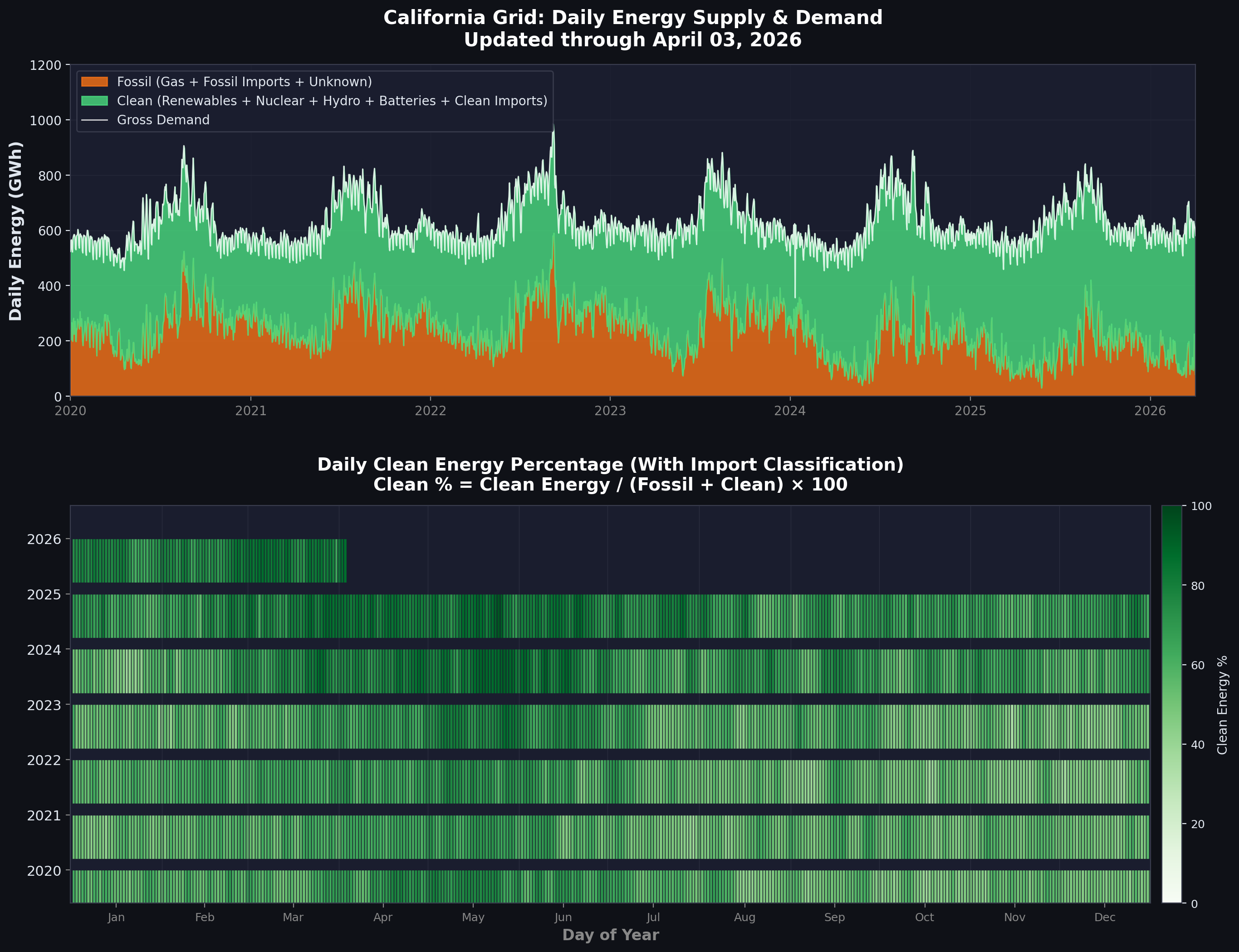
The revised energy breakdown (V2) reclassifies imports based on merit order dispatch results. Fossil now equals CAISO natural gas plus fossil imports (coal, gas, oil from neighboring states) plus unknown imports (conservatively classified as fossil). Clean equals CAISO clean sources plus battery discharge plus clean imports (hydro, nuclear, renewables from neighboring states). Gross demand remains unchanged, matching V1 exactly. Clean percentage is calculated as clean divided by the sum of clean plus fossil, multiplied by 100.
The transformation is striking. Panel 1's stacked area chart now shows only two categories: fossil (orange) and clean (green). Total fossil averages approximately 242 GWh per day (38.4%), while clean sources average about 379 GWh per day (61.6%). The visual impact is immediate—the purple import wedge from V1 has been reclassified and absorbed into the two primary categories, revealing a cleaner grid than previously apparent.
Panel 2's calendar heatmap shows daily clean energy percentage now ranging from 50-80% rather than 40-70%. The color intensities shift from light-to-medium green in V1 to medium-to-dark green in V2, reflecting the 10+ percentage point increase. Spring 2025 shows some days exceeding 80% clean energy—dark green squares that barely appeared in V1.
The clean energy percentage comparison tells the story: V1 calculated 50.9% clean (treating imports as unknown), while V2 calculates 61.6% clean (classifying imports accurately)—a difference of 10.7 percentage points. This isn't creative accounting or wishful thinking; it reflects reality. Most imports come from regions with predominantly clean generation. The Pacific Northwest exports primarily hydro. The Southwest increasingly exports solar. V1 penalized California by treating these clean imports as "unknown," while V2 credits them appropriately.
Some might argue this overstates California's achievement since the state depends on out-of-state generation. However, electricity grids are inherently interconnected—no region is an island. California exports solar to neighbors during midday oversupply and imports hydro from the Northwest and wind from the Southwest during evening peaks. This mutual dependence enhances reliability and enables higher renewable penetration across the entire Western grid. Accounting for cross-border flows accurately reflects each region's contribution to collective decarbonization.
11. Conclusions
California's electricity grid underwent a historic transformation from 2020 to 2025. In just five years:
Major Achievements
- Clean Energy: Reached 61.6% clean electricity when imports are properly classified (up from approximately 45% in 2020)
- Battery Revolution: Deployed 11 GW of battery storage, transforming from novelty to necessity
- Natural Gas Decline: Cut gas generation by 26.4%, from 8,406 MW to 6,188 MW average daily
- 100% Clean Hours: Best days achieved 10-11 hours of 100%+ clean generation, with consistent 5+ hour days in spring
- Negative Prices: Solved the oversupply problem—negative price hours dropped 57% in 2025 after peaking in 2024
Key Lessons
1. Batteries Are Essential
The inflection point came when batteries reached 6-10 GW capacity. This "critical mass" enabled absorbing solar oversupply (preventing negative prices), displacing gas during evening peak (largest emissions reduction), smoothing the duck curve (reducing ramp requirements), and providing all ancillary services (frequency regulation, reserves). Without batteries, solar growth would have stalled due to oversupply problems and reliability concerns. With batteries, solar and storage became a complementary system greater than the sum of its parts.
2. Price Cannibalization Is Real
Battery deployment created a classic "tragedy of the commons." The first wave of batteries (2020-2022) earned high revenues from scarce capacity—energy arbitrage spreads of $150+/MWh and ancillary services payments of $100-150/kW-year. As capacity saturated markets, price spreads collapsed to $30-60/MWh and ancillary services revenues fell 60-80% from peaks. By 2025, batteries could no longer rely purely on market revenues. Future projects need capacity payments, tax credits, or other revenue sources beyond pure arbitrage. This poses a policy challenge: how to maintain deployment rates when economics weaken, especially as the remaining emissions reductions require even more storage.
3. Import Classification Matters
California's true clean energy progress was understated by treating imports as "unknown." Using merit order dispatch modeling to classify imports reveals they are 70.5% clean, mostly Northwest hydro and Southwest renewables. Accounting for this raises California's clean percentage by 10+ percentage points—from 50.9% to 61.6%. This lesson extends beyond California: grid accounting must trace energy sources across state lines to accurately measure progress and avoid undercounting clean energy in interconnected systems. Regional cooperation on data sharing and methodology standardization would improve policy decisions and public understanding.
4. 24/7 Clean Energy Remains Challenging
Despite dramatic progress, achieving 100% clean electricity 24/7/365 requires technologies and policies not yet deployed at scale. Long-duration storage—current 4-hour batteries can't bridge overnight; 8-16 hour systems are needed. Transmission expansion to access remote wind resources in Wyoming, Montana, or New Mexico and enable inter-regional balancing during extreme weather. Demand flexibility to shift loads like EV charging, industrial processes, and HVAC to match generation rather than forcing generation to match demand. Firm clean resources like enhanced geothermal, next-generation nuclear, or green hydrogen to provide multi-day reliability during winter storms, heat waves, or simultaneous low-wind low-solar events ("Dunkelflaute").
Looking Forward
California has proven that rapid grid decarbonization is possible—but the easy gains are behind us. The path to 100% requires continued cost declines in storage, targeting $100/kWh for long-duration systems compared to $200-300/kWh today. Policy reforms to reward clean firm capacity, not just energy—capacity markets, resource adequacy payments, or clean firm standards. Market designs that prevent excessive cannibalization while maintaining investment signals—perhaps through separate long-duration storage procurement or revenue floors for early-stage technologies. Regional coordination to share resources across the Western grid—California cannot achieve 100% clean alone; integration with neighboring states' hydro, wind, and geothermal provides mutual benefits.
If California maintains this pace—adding 5-10 GW of storage annually, continuing solar and wind deployment, expanding transmission, and implementing demand flexibility—80% clean electricity is achievable by 2030, with 100% within reach by 2035-2040. The technological barriers are surmountable. The economic barriers are narrowing with cost declines and policy support. The primary question is political will: can California sustain the commitment, investment, and occasional short-term pain (higher electricity rates during transition, transmission siting conflicts, equity concerns) required to complete the transformation?
The 2020-2025 period proved it can be done. The 2025-2035 period will reveal whether it will be done.
Data Sources: CAISO OASIS (fuel-source, pricing, ancillary services), EIA Form 930 (interchange), California Energy Commission (import mix)
Analysis Period: January 1, 2020 – December 31, 2025
Methodology: Merit order dispatch modeling, capacity factor analysis, ramp rate calculations, carbon intensity estimates
Last Updated: March 2026